The Internet was a vital piece of technology that has helped us throughout the whole process of the development of our coursework for both the main and ancillary task. The first use of the internet was for the research in to music videos and then more deeply into the music genre our group was going to focus on. Global site YouTube has helped our group massively as we were able to load up specific videos that related to our genre and analyse them and take key conventions out of them. If we did not have access to a video site that shows music videos, then we would have had to have sat in front of a TV and analyse the videos that we were given, something that may not have even been beneficial to our genre of music. As well as this, the internet meant that our research in to our ancillary tasks was genre appropriate and that we carefully analysed the images that were on the screen. For example, from looking at adverts for Rihanna we realised that the artist is always in the forefront of the advert. We were also able to look at the house style between album artwork and magazine adverts, thus keeping our brand identity. Using the internet enhanced our
knowledge into the music industry, and if we did not have access to this, then our research stages would have been heavily delayed.
As well as researching just in to music videos themselves, we also were able to use the internet to aid us in how to construct one ourselves. Before the project was tasked to us, none of us knew how to operate Final Cut to a standard that was required, and the internet had many videos and forums that we were able to locate and heighten our knowledge. Without the internet in the research stages of our coursework, we would never have been able to identify how to professionally construct an appropriate media package that has a
consistency with the music video.
The internet was also used in the planning stages of our coursework. Before we set off and started to film anything, we had to plan where we were going to go and the use of google maps enabled us to easily identify where it was we were going to film.
Another key website that was fully taken advantage of was Blogger. The website allowed us to ‘blog’ our stages of our work in a neat and professional manner where we have access to other peers studying the same course, which is ideal for product feedback. This use of communication helped us to identify weaknesses and improve the quality of our video and ancillary tasks. The website allowed us to exhibit all of our work which is a fantastic way to place work as the media is becoming more and more dependent on the internet. If we did not have use to blogger, then we would have had to written the whole of the coursework by hand, which would have been time consuming and messy.
Other internet sites such as prezi and viemo were used. Prezie, which was useful in our planning stages was effectively used as it displays a presentation style piece of work in an aesthetic way, and vimeo was used to upload our final cut and showcase our video as it was of a higher quality than uploading it to YouTube or as an mp4 format. Without the internet and the sites that are available we would not have been able to produce such a media rich portfolio throughout all of the stages of the coursework.
When creating our media product audience feedback was crucial, especially recieving feedback from people that are in our target audience. This was helpful, it helped us to gage as to how well we were catering for our audience. We were then able to make some minor amendments to our work based on the feedback we recieved.
Teacher
Here is a replication of the conversations me and my teacher had. She was harsh but fair in her critic overall it was her feedback opened our eyes as to how much work we needed to do.
Before we could start our video we had to run our song choice and idea through our teacher. If we were able to choose the first song that came into our heads our video may not have been as good as it is. We also would have dived in and used the first design for our adverts and digipak rather than thoroughly researching the key conventions and working out which of these we would follow and which to challenge. Looking at our original ideas we would not have been happy if they were our final products, without teacher feeback we probably would have stuck with these ideas because they were done quickly.
After editing our rough cut we and the rest of our media class had a feedback session in which we all sat down infront of the big screen and watched eacher others rough cuts. This was good as we were able to get feeback from our peers, who fitted into our target audience. Also our class mates have been through what we have been through so they were able to give useful and quality feedback and specific ways we could improve our videos. Our teacher was also in attendance and was able to add further to our feedback which was helpful. After this feedback we were able to make a plan of action which helped us improve the quality of our work. The feedback session was also useful for us as we were able to sit back and look at what we had done, when editing on final cut we did not have time to evaluate the work we were doing properly. We were also able to look at what other people had done in their videos and pick out some good ideas.
When our final cuts were almost nearing completion we had another feedback session which was again organised by out teacher. This time the two media groups joined to provide feedback on each others work. This was useful for use as we gained additional feedback from people who had not seen our rough cut, we were also able to see and compare the feedback given by for the rough cut and the final cut. It was also interesting to see if people thought our work had improved.
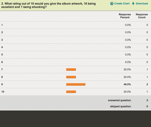
After finishing the video and ancillary tasks I wanted to get some feedback to see what members of our target audience thought of the products that we have designed. This would give us some idea of how well we have fulfilled the brief we were given. I decided to use the website survey monkey construct a quick survey for people to do which would give me some valuable feedback. I added 6 questions that I wanted people to answer, I then posted both the ancillary tasks as a seperate link and the video, I asked people to view the products and then fill in my survery, via twitter and facebook.
These results are very valuable they show that for most of the areas we have fulfilled our brief, 100% of people said that the ancillary work looked professional, this was very rewarding for myself as this was our main aim at the start of the year. 60% of people said they would buy the album if they saw the advert. This is another good result as the advert is used to promote the album and generate interest in the artist. These results suggest our audience believe the two compliment each other well. It also means that the advert promotes the album and the artist.I was slightly dissapointed with one answer, which was a 6/10 for how eye catching are the products. I feel that the products do engage with the audience with the use of bright colours, however for someone of our audience to give this mark is slightly dissapointing. One more piece of feedback
Here I have used Wallwasher, to give the oppurtunity for my collegues at work to give me feedback on my products. Because I have recieved alot of feedback from similar people at school I wanted to broaden this feedback to people at my work, who are at different ages to people at school and also have different interests.
After recieving this various feeback especially for our rough cut we came up with a plan of action.
How effective is the combination of your main product and ancillary texts?
The relationship between our main task, which is our music video and our ancillary tasks, the digipak and magazine advert is crucial. We needed to ensure this relationship was very strong in order to create a strong and effective media product for our target audiences fulfillment. We needed to create a strong brand identity to ensure audiences across the world and develop a global brand. People will then recognize our products and buy them.
We feel that throughout our video we have made intertextual links in our three tasks, by using locations on our digipaks that have been used in our video. The shot on the back panel of our digipak is used in our video. Also our main character Glenn is on the front of our digipak, our magazine and is in the video, it is pivatol that Glenn is present in all three media platforms. By keeping the same artist its an effective way to keep a house style and make it easier for our audience to associate and put the three together.
Research
When creating our media product we decided as a group to choose a genre of music that we enjoyed and had knowledge about. This improved the quality of our ideas as we were more familiar with what is seen in an Alternative Rock music video. Alternative Rock is a very popular genre and includes bands like Coldplay,Oasis,Kasabian and Noel Gallaghers High Flying Birds. The popularity of this genre means that their is a large target audience around the age of 18-21. Our audience is of a similar age to use, this helps us because we know what people their age look for in a music video and in a digipak. Once we found the age of our audience we had to look at what were their needs and how would we fulfill them. To do this we used UK Tribes website, this helped us because we could attempt to relate to them when creating our media brand. Before we started making our video we need to explore ways of appealing to our audience in our video, how can we engage with them. We found that the best way to do so was the use close ups of Glenn and make sure he kept eye contact with the camera throughout the majority of the video.
Narrative
Image, Colour and Fonts
We needed to establish how we were going to make our audience buy our digipak something that drew them to it rather than buying a different album. When researching Noel Gallaghers album we noticed that they effectivley used a gradient. We realised that this would help our product stand out on the shelf and capture the audiences eye when shopping. We could also use this gradient to create a house style and create a brand identity that become notorious with our target audience. We wanted to make a digipak that used bold colours, many albums are uninspiring and lack colour we felt that our album colours would encourage people to buy. If a potential buyer sees the advert with the colour scheme of green and orange they will relate this to our digipak when they are shopping they will see the gradient used on the CD and link the two together. We also used the colour to highlight things we wanted our audience to see, for example the ratings. We decided to put the ratings in the orange colour because we felt it woul jump out to the audience which may encourage them to buy the digipak. The large quote under the title is in white with a black stroke, we also want people to see this as it may enocurage them to buy the digipak. However we felt using the white colour would improve visability, if we had put it in orange again it may have blended into the background and not stood out. We have used a text box so that we can display information in the house style colours. We could not do this on the normal background because of the colour. We changed the opacity so the box did not dominate the advert and take away from the picture and other information, but you can still see the information.
The use of fonts also helps our audience link the different platforms together. This is mainly done by the use of the title font on our digipak. We have used the same font style in order to create a strong house style, however we have adapted this slightly. This is done by the background that is put on our title in our magazine advert, however it is in the same font, bitume, and the background colours are relevant to our house style which means our audience can relate between the two. We felt that using the same title would make the advert look plain and not catch the eye of the general customer. We wanted to alternate and mix it up with the design but we feel that we were able to do this without comprimising our house style. We did this because we felt people tend to just gaze at an advert, if they see a plain white title they generally do not look back. We needed to inspire this second look so we added a bit of colour to the title so that it would catch peoples attention. We also wanted a font that would catch the eye of our audience, we did change our font because we felt it was too plain and did not stand out. We have used similar fonts throughout our digipak, all the titles are in the same colour even on the CD disc, also the font of our record label is consistent. We did introduce a different font on our magazine advert, this because we needed visability so that our audience could read and be informed. We did not believe that any of the fonts we had used were suitable so we used a plainer font that we felt still fitted with our house style.
The image used on our front cover of the digipak is a location that is used in the video, which again strengthens the link between the two. Our audience may be watching the video on MTV Rocks or You tube and see the location, they will be able to link certain scenes to the front cover of our digipak. Also the fact that we have an image of our artist on the front cover helps develop this already strong link and keeps the mise en scene consistent by keeping what Glenn was wearing the same as his attire in the video. We have used the same picture on the digipak as we have on the magazine advert. However we have used it in a different way, the magazine image in stretched so that their is room for the additional information that is not needed on a digipak. We felt using the same picture would help our audience link the two together. Also the other images used on our digipak are linked to our video, the inside panel shows a guitar that is used throughout, this is also a key instrument used in alternative rock, it is something that our target audience would expect to see in our video and digipak. The back cover is also a shot taken directly from our video. The images have all been mainpulated in the same way by having a gradient placed over them.
What would you improve?
With hindsight I would have done many things differentley especially in the construction of the music video, but I would have changed elements of the digipak and magazine advert.
Music Video
We as a group should have done alot more planning for filming our video, we should have started filming alot early than we did. This would have allowed us more time to practice getting used to using the camera which would have improved the quality of our video. Some of our camera work was shaky at first which meant that we had to spend alot of time editing around our problems. We also had some problems with commitment of our character, we should have sorted this early than we did rather than letting ourself get behind. Also scheduling was an issue, we all had other commitments and were not always able to attend which means things may have been done differently. We should have filmed more in half term when we had more free time without work commitments. We felt that travelling meant we did not always have alot of time in London. Although we felt the video being filmed in London made it look more realistic it was very ambitous considering our time constraints. The time constraints meant that we had to film fairly late because we wanted to utilise the time we did have. This meant some of our footage was too dark to use, if we had started earlier the evenings were longer in terms of light and we could have utilised this. Looking at some other work by other groups looking at it know it would have been easier for us to do a performance based video. We could have chosen an authentic location that was local and easy for us to get to. We would have been able to film more often and groom our camera skills to make a better video. With hindsight we could have made a mock video just to test and improve our filming, as a group none of use have used a proper camera in this scenario. We found keeping a steady hand was important when back at school on finl cut these shakes really show up. The song we chose had limited lyrics and had a lot of empty spaces to fill, it was easy for us to find links between the lyrics and come up with good visual ideas but when there is no tempo or real beat to the music it is hard to think creativley. We then spent to much time thinking of ideas and storyboarding which meant we had less time to film. Some of our original ideas were unrealistic and were impossible to film, if we'd had expirmented more we would have discovered this earlier and been able to brain storm new ideas, rather than improvising in London. Personally I believe we should have filmed more close ups of the instrument Glenn was playing as this is a key part of our genre of music. I feel we did not utilise this often enough. Also during the madness of making a music video we went away from some of our original ideas that we had earlier in the year. One idea was to have Glenn busking, we did not use this particular idea except for money being dropped into the guitar case. We also wanted to show more aspects of life in London, again when in London it was very hard with the time constraints to find and film enough footage like this. We did not want to spend hours walking around looking for people to film and get back to school with nothing to edit, if we had of started filming earlier this may have been possible.
Digipak
Personally I am really pleased with our digipak and I believe we have fulfilled our brief. We have made a professional digipak and created a strong house style throughout, whilst creating a brand identity for our magazine advert. I felt that we should have changed the font and we made this change I believe that that made it more eye catching. Possible it could be argued that Glenn should be looking at the camera to encourage the audience to buy the product but I feel this picture is just as effective.
Here is another form of feedback I recieved, this was a survey I did on survey monkey. I encourage people to view my groups media products and then complete the survey. I used Facebook and Twitter to advertise this survey and encourage feedback from peers.
Here is our final magazine advert, we are very happy with the overall outcome. It incorperates the key colours and fonts that we have used over our digipak. We feel that it looks professional and does not have to much information on it.
Here is a short video clip of the stages and order that we designed our magazine advert. Using software called 'Jing' I was able to film what was happening on the screen. This is an effective way of showcasing how our work was constructed without just typing it out.
The first thing we did when making our magazine advert was selecting our picture. We decided to use the same image that we used on our digipak, this would help create the link between the two. However we did not want them to look exaclty the same so we toned down the gradient and switched it around goin for orange to green. We felt this would add variety without comprimising our house style.
Here on the left is me putting the gradient on the picture. After this was done the next step was to add our title, we knew we were going to use the same font to maintain our house style. We all felt that the plain white text did not look aesthically pleasing, we needed our title to grab peoples attentions. I was playing around and moved an orange box which was made using to rectangular marquee tool. I dragged this into place, we liked this design but felt we needed to introduce our other colour from our house style. I copied the box and using the paint bucket and colour picked the same green and made the box slightly larger than the orange one. I then matched the box so that the blue line above and below were equal. The text 'High Flying Birds' need some colour added to it, so I used the same green and kept the black stroke around the outside.
Here is what it looked like when we had finished with the title. As a group we felt this fitted well with our house style and would attract our customers to look at the advert.
Magazine adverts need to have information on them to inform the audience of what songs are in the album and what sort of ratings its recieved. To do this I used the rectangular marquee tool to draw a large black box, which was placed over the bottom third of the advert. I then increased the opacity so that the picture could still be seen underneath, the solid black colour would have been overpowering. I then introduced some of the main conventions of magazine adverts which were ratings, quotes from magazines and featured songs. I typed these in a clearer font and added a stroke to them to make them stand out from the background becasue we want the audience to see them clearly. I then moved the main tag line above the picture so that it could be easily seen.
I then added a solid rectangle box and left it pure black, however this was only small so it did not over power any of the other key elements on the page. I then added other information to promote the band and record label.
Here is our final digipak, top left is the back cover. Top right is the front cover. Bottom left is the inside cover and bottom right is the disc panel.
By using the morph tool on Photoshop Adam managed to transfer our work onto a template of a CD case. This has given us the oppurtunity to see how what it would look like on the shelf of a shop.
Firstly we found a template of a CD on the internet, Adam saved it and loaded it up on Photoshop. We chose to use a plain template so that we could add our gradient in order to maintain our house style.
Adam added the gradient onto the plain disc, we used the same colour gradient in order to maintain house style and consistency throughout our digipak. Adam used the magic wand tool to select the disc, so we could put the gradient over the area we wanted it to go. Once this are was selected Adam dragged the gradient top left to bottom right. This is what way we dragged the gradient on all the other panels so this was a neccessary thing for us to do.
We then need to add the key information that is required to make the CD look authentic. We have followed the main conventions, we have done this by including the song name and band name in the same colour and font that is used on the front cover. Again this is to maintain a consistent house style. We also decided to add the record label at the bottom, most artists tend to recognise the record label on the CD so we have. Our design is similar to the actual CD of Noel Gallaghers album, however we have added our own stamp by putting the gradient on it.
Below is our final CD, we have changed the font because we did on our front cover. If we had two different fonts we would have failed in creating a consistency that is a key convention of digipaks. We believe that if a stranger was presented with our CD and front cover amongst a table full of our competitors an muddled them up they would be able to pair our two together. We believe we have created a strong house style.
Here is our finished back cover. As you can see we have added the same gradient to the back cover which is on the front cover. This helps us maintain our house style and continuity. I believe this image is very effective again it is another action shot which fits with our song. This portrays life as it is happening, we have managed to capture people living their lifes. The gradient works very effectivley, because the green section covers the river thames, which is its natural colour. The orange then covers the building whichs natural colour is similar to the orange. This makes the gradient look natural and subtle.
You can also see we have moved the copyright to the bottom as matt suggested, personally I feel that it looks much better there. It is a feature that must be subtle you do not want it to overshadow the picture nad the song list like it did in its previous position.
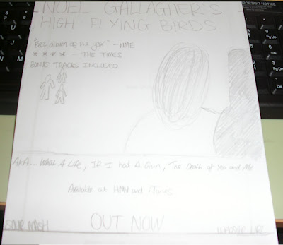
Here was my first draft for our advert. I had started doing this before we decided to change the font on our digipak, so we had to do it for our advert to maintain our house style. I wanted to use a convention of picking out a colour from the picture and using it for the title. I played around using the colour picker tool and used the brown colour from Glenns guitar case. We also decided to leave the gradient off the image because we felt it might have dominated the other text on the page. I then added a tag line using orange, and the song name as it appears on the front of the digipak. It was when I added the drop shadow that as a group we realised we did not like this plan, it did not link very well to our digipak so we went back to the drawing board.
When I come to reconstructing this advert I am going to use fonts and colours that will link the advert to the digipak. I am also going to use the gradient tool to link the digipak and the advert.
This is the first attempt of our back cover. We have taken an image that is used in our video, this again strengthens the link between our video and digipak. For our song list Adam decided to use the mistral font which we have used on the front cover. This helps maintain consistency and makes our digipak link across our four panels. The font is also similar to that used on the back of Noel Gallaghers Album, this helps increase the authenticity of our media product and the make our product genre specific.
Another convention of back covers is a bar code, this will also improve the authenticity, if we had missed this out then our product would not have looked professional. We then added the record label onto our back cover this is again essential for us to put on our back cover. For this we looked at the font Sour Mash Records is written and looked at similar fonts on dafonts website, we found a font called 'Boingo'.
Adam then changed the vibrance of the picture he changed it up to +23. Again making the image sharper and giving the picture that professional finish. We then needed to add the legal content that is another small but crucial element of a CD. I found my Oasis album and copied this copyright information altering the information to make it specific. We originally put this on the right but Matt believed that we should put it along the bottom which we eventually decided to do.
After researching numerous albums from artists such as Oasis, Professor Green and Plan B Adam discovered that the first inside panel generally contains a simple image. As this is a convention we followed this, we wanted an image that would represent our artist and genre of music. Adam looked through some pictures of the guitar we took when filming and found this image that fitted perfectly.
The image needed manipulating to create the effect we wanted. Adam selected the wall and put a gradient in the form of a linear burn which we used on the front cover. This helped keep the consistency that is needed when generating a house style. He then changed the vibrance and brightness of the guitar to make it stand out and give it emphasis. These changes made the image sharper and clearer for the customer. They yellow of the guitar know stands out and is a deeper colour.
Once the image was edited and we were all happy, Adam started looking at what other conventions inside panels have. We felt that there was something missing from our inside cover. We found that some artists put upcoming tour dates on the inside, however we felt this would not work for us. Adam decided to add the website of Noel Gallagher which helps us promote the artist, without destracting from the main picture on the panel. It also allows our customer to find out more about the band online which encourages interactivity.
Adam decided on a plain font for this as we did not want it to be to bold. He used calibri with a stroke of 2.
Below is the final inside cover, we feel that the gradient links it to the front cover and helps keep our consistency and maintain our house style.
As a group we all wanted our digipak to look professional, we wanted to create a digipak that would not look out of place next to current albums. Adam found an old CD case and printed out our panels to the correct dimensions.
He then found some of his collection of albums and put ours up to the test against professional work. Overall we are very happy with our digipak and feel our work has conventions of music digipaks but has unique edges. We feel the gradient we have used has enabled us to create an eye catching front cover that will stand out against its competitors and catch the customers eye.
This is a picture of the inside, again we feel that the constistency of colours has helped us create a consistent house style. Printing each panel out has been very rewarding for us. When you see a piece of work on a computer screen it is different to if you see it as it would be sold. We have been able to see how the four panels flow and compare the use of colours and fonts. On Photoshop we were working on each panel individually which means when it was all put together in a real CD case we can see what the relationship is like.
Now that our digipak is nearly finished we are starting to plan our magazine advert. Although we have a rough idea of what fonts we want to use and colours the layout and positioning of texts has to be decided. Our plan has helped us determine the best positions to put the most important text, the text that entices our target audience to buy the digipak. This is why we have put a quote with a very high rating from a well respected magazine at the top.
The image we have chosen is the same as the one on the digipak. However because the digipak is a lot smaller we are going to change the dimensions of the picture so that it is slightly different. The picture we have chosen is ideal as it has plenty of space above Glenns head for the title and our magazine quote.
We have also decided to add a drop shadow at the bottom of the advert, we feel this breaks the page up and allows us to clearly display text. The drop shadow will have in it important information such as what songs are on the album as well as more ratings to pull our audience in.
After recieving feedback from peers and our teacher we decided that our second idea was good but was too bland. Adam decided to add the gradient again as we felt that this would be the missing piece to the puzzle. Our original idea was not eye catching, it would not jump of the shelf to our customers and it lacked the wow factor.
However our original gradient was too overpowering so we would have to tone this down in order for it to look effective. Our peers felt that the original gradient dominated the picture as it too away from the original image we had taken.
This is what Adam did to improve the front cover. He increased the opacity so that the gradient was not as overpowering as before. The mode was also changed from colour burn to linear burn which also helped tone down the gradient and make it more subtle and effective. As a group we felt that this front cover was an improvement. The gradient would give us the oppurtunity to emulate Noels digipak and create our own house style throughout. The image before had no stand out colours that we could pick out and use on the other panels. The gradient has allowed us to use the green and orange across our digipal, which will help our audience link all our digipak together succesfully. Adam also decided to underline the title 'What a Life', because it is on a dark background, this makes is easier to read and stand out more.
We decided that we should try without the gradient tool. We decided that the image we chose was best as it ticked all the boxes. Instead of the gradient Adam manipulated the contrast, vibrance and brightness of the picture. Adam felt that the gradient dominated the picture and matt and I agreed and felt we should experiement without the gradient.
The brightness made the picture look alot cleaner, the brightness of the image when compared to the original is staggering. The the whole image becomes more recognisable and the features of the picture stand out the our audience rather than the powerful gradient. The sky is lighter which means the title text stands out more.
The contrast makes the building on the left stand out more, this gives the image a stronger colour and sharpens up the whole image to make it look authentic. The contrast has drawn out colours that were not a vibrant in the original dull image. This gives us the effect of using a professional camera.
Here is our second idea for an album cover. We have reviewed our previous idea and kept aspects we liked and removed some that we felt did not work. We decided to experiement with a different picture, personally I prefered this picture, it is a location we have used in the video. It also has a notion of looking, Glenn is watching other people in their everyday life. We found when researching the artist is not always looking at the camera. Adam changed the opactity of the gradient to 28%, he applied the gradient twice but this time changed the mode to colour burn. We felt our previous cover was too bland the image was not sharp, this is because the previous mode was overlay, the image was not effected it was almost as if someone had put a see through cover over our picture. Colour burn actually changes the sharpness of the picture. We felt this worked better and looked more like Noels digipak. Adam then changed the title font, he added effects like the stroke and contour to make the font stand out more against the light background.
We feel this image will help our target audience link our video to the album, because Glenn is on the fron cover, and aswell as this the location is we have used is in the video. I feel this shot was an action shot, we did not want our covers image to look set up completley. Because it is a narrative our image must capture Glenn in his observing of life.
We looked back at our digipak and were very happy, however one thing was bugging us the black background that was behind our CD was dull and did not fit our house style. As a group decision we decided to change the back ground for something more appropriate. We had used a brick wall on our inside panel so we decided to do this on this panel just without a guitar. Adam took a grab of the wall from on of the locations we used in our video and uploaded it to photoshop. He then moved the layers around so that the brick wall was in the background, this gives is a subtlty.
Adam started using Photoshop to experiment with some front cover ideas. He took a picture of Glenns guitar that we had taken when filming. He then added the gradient that we had identified on Noel Gallaghers digipak. Adam transfered the gradient that I had created onto his computer. Before he did this Adam changed the opacity of the picture as the original image was too bold and needed to be subtle.
Adam then added the text that was neccessary to make our cover look authentic. Collectivley we looked through Da Fonts website a identified the fonts that we thought best matched the image and the house style we were trying to create. The fonts we used were Coaster for the band and artist title and Mistral for the other text on the cover. We also noticed that on Noel Gallaghers digipak he has the 'o' in Noel smaller with an underline. This would increase the likness of our product to Noels digipak. To create this effect we highlighted the 'o' then chose the "superscript" option.
Here is what Adam produced as our first idea for a front cover. We felt as a group that our front cover should be simple, because we felt it is difficult to represent the song title "What A Life" with a single image. We believe that the image of the guitar links with our video as Glenn uses the guitar in the video, this enables our target audience to link the two together something which is very important when creating a media brand. Adam decided to add strokes around the text to help them stand out against the background, as this is what we what our target audience to see, we need the key information to stand out.
Once the video was done we needed a way of showcasing our work on our blogs. We saved our video as a Quick Time Movie and we opened it in a programme called MPEG Streamclip. The video was converted to a mp4 clip which meant we could upload it to vimeo. This would allow us to put the video on our blogs, also vimeo is a high quality programme which would give us a clearer and sharper video.
We then embeded the html clip onto our blogs this allowed us to recieve feedback in our class session, if our video was not uploaded then we would not have been able to view it.
Before creating our Digipak we have drawn up a plan of what we want our the front cover to look like. The picture we have chosen is an over the shoulder shot of Glenn observing 'life'. From our research we indetified that front panels were not overcrowded but had a close up of the artist, however we feel we have developed this convention.
However when in Photoshop we may have to alter the picture size to fit the text in. We are also contemplating adding the gradient that we identified in Noel Gallaghers digipak. This will help us create a strong house style throughout our digipak.
When briefed with making a music video we wanted to make it look as authentic and realistic as possible, so to improve our video we added some key conventions of music videos. To make our video look fit to be shown on MTV we added were the MTV ROCKS logo that appears when a video is being shown on television. We used the Rocks symbol because we felt if our video was to be shown reguarly on one specific channel it would be MTV ROCKS. Another key convention is the opening and closing pop up panel, displaying the name and artist of the song.
To add the logo Matt found the desired image on the internet and imported it into Final Cut it was then dragged into the timeline just like a video clip. We wanted the sign to be shown throughout the whole video so we had to strectch the picture across the whole span of the song. This was done by selecting the right hand side of the image and dragging it until the end of the song just like if we would if we wanted to increase footage length of a clip.
Screen Grab
To add the opening and closing titles Matt went onto the MTV website and grabbed a section of the green that is associated with MTV ROCKS. He then opened the image in Final Cut dragging it onto the timeline, then re size the picture so the dimensions were correct and it was on the screen for the correct time.
Matt then set about adding the text to the box. He selected effects and then clicked on the Video Generators section, this showed a section named text, when Matt clicked on this another menu popped up that allowed text effects. However we wanted a simple text so Matt clicked on text again, this then allowed Matt to write the text that was needed, ' What a Life' -Noel Gallagher. He then dragged this text from viewer to the timeline and matched it up with the green background making sure it was allinged. We also needed the green box to appear slighlty before the text pops up because this is a key convention. Finally Matt added a transition to the box, if it appeared from no where it would look very odd and would not fit in with the rest of the video. Adding this transition was done easily it was done exactly the same as all the previous transitions in the video.