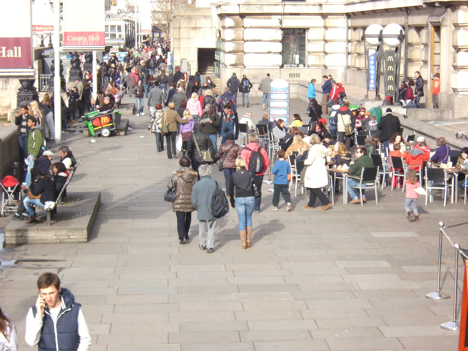
I started by reading a copy of Q magazine and I came across some of the adverts, so I typed them into google to find the album cover that accompanied them.
 The first advert I found was advertising Adele's new album 21. I started by looking at the fonts used, the title font 'ADELE 21' the font and colour scheme is used consistently throughout. With the artists name in white and the title of the album in green. Green is then used once more on the advert, this is evidence of creating and using a house style that makes these two easy to pair. The pictures are both very similar, firstly both are black and white which helps keep continuity. In both the artists gaze is directed away from the camera, the pictures are very similar which maintains continuity. Just in case someone does not make the link between the two, they have added a small version of the album cover on the bottom of the advert. This helps to customer when buying the album because they know what to look for.
 I then came across another advert in Q, this one was for White Lies debut album, 'Lose my life'. The relationship between the album cover and advert is very strong, but I believe that using the same picture twice lacks imagination. Adele and her designers have done it perfectly in my opinion, they are not using the same image twice but it is very similar so it maintains the house style without looking as if they have just cut corners in the design process. However the title fonts are the same, this is something that we will defiantly be doing across our digipak.
  Here is both the magazine advert and the album cover for Rihannas new album 'LOUD'. The house style created between the two is very strong, this is done by the consistent use of fonts. The title font is in exactly the same font and colour which creates a positive relationship between the digipak and advert. The pictures are different but are have similarities, the album cover is a close up of her face whereas the advert is a medium close up. Rihannas hair style is exactly the same in both images and they have even put in a screen grab of the album on the magazine advert. This helps the audience make the link between the two pieces of media, this can be seen in Adeles media brand above.
 The relationship between Jessie J's album artwork and the magazine advert is very strong. The main similarity is the image, they have used the same image of her to increase the relationship between the two. The dimensions are exactly the same, they have added the album cover to an A4 dimension window and then filled the empty space in black. The black used to fill in the box also fits the house style as it matches her hair colour, lipstick, clothing and nails. The fonts and colours are used constistently throughout, the gold from the title is used to highlight text, 'debut album' and Includes the #1 international smash' this again strengthens the house style between the two.
The magazine advert and album artwork for Plan B's album The Defamtion of Strickland Banks also have a strong relationship and consistent house style.  The main colour used is Red, this is used over both of the platforms to maintain the house style. Red is used for the titles of each page which helps create a rating system based on colour. Red is used to catch the eye of the audience, it also highlights the main tag line on the advert. The images are different one is black and white and one in colour, however the audeince can still see that the artist is the same. This is done by the use of the microphone on the advert which links to the performance based setting on the artwork, including the sign at the top of the album. Also similarly to Adele and Rihannas there is a small screen grab on the album put on the advert this is useful for the audience as they know what to look for on the shelf.
The main colour used is Red, this is used over both of the platforms to maintain the house style. Red is used for the titles of each page which helps create a rating system based on colour. Red is used to catch the eye of the audience, it also highlights the main tag line on the advert. The images are different one is black and white and one in colour, however the audeince can still see that the artist is the same. This is done by the use of the microphone on the advert which links to the performance based setting on the artwork, including the sign at the top of the album. Also similarly to Adele and Rihannas there is a small screen grab on the album put on the advert this is useful for the audience as they know what to look for on the shelf.
Overall the links between the digipak and advert are clear for us to see. The images are similar and in some cases the same, the use of fonts are consistent over the two, no new colours are introduced on the advert that have not been used on the album. This strengthens the house style and is something we will have to consider when constructing our album. Another convention I have discovered is that taking a screen grab of the album and putting it on the advert so the audiences know what to look for.