Saturday, 10 March 2012

CD Cover Idea 2

Here is our second idea for an album cover. We have reviewed our previous idea and kept aspects we liked and removed some that we felt did not work. We decided to experiement with a different picture, personally I prefered this picture, it is a location we have used in the video. It also has a notion of looking, Glenn is watching other people in their everyday life. We found when researching the artist is not always looking at the camera. Adam changed the opactity of the gradient to 28%, he applied the gradient twice but this time changed the mode to colour burn. We felt our previous cover was too bland the image was not sharp, this is because the previous mode was overlay, the image was not effected it was almost as if someone had put a see through cover over our picture. Colour burn actually changes the sharpness of the picture. We felt this worked better and looked more like Noels digipak.  Adam then changed the title font, he added effects like the stroke and contour to make the font stand out more against the light background.

We feel this image will help our target audience link our video to the album, because Glenn is on the fron cover, and aswell as this the location is we have used is in the video. I feel this shot was an action shot, we did not want our covers image to look set up completley. Because it is a narrative our image must capture Glenn in his observing of life.


Changing the CD

how do you make a gif


We looked back at our digipak and were very happy, however one thing was bugging us the black background that was behind our CD was dull and did not fit our house style. As a group decision we decided to change the back ground for something more appropriate. We had used a brick wall on our inside panel so we decided to do this on this panel just without a guitar. Adam took a grab of the wall from on of the locations we used in our video and uploaded it to photoshop. He then moved the layers around so that the brick wall was in the background, this gives is a subtlty.

Friday, 9 March 2012

CD Cover Idea 1


Adam started using Photoshop to experiment with some front cover ideas. He took a picture of Glenns guitar that we had taken when filming. He then added the gradient that we had identified on Noel Gallaghers digipak. Adam transfered the gradient that I had created onto his computer. Before he did this Adam changed the opacity of the picture as the original image was too bold and needed to be subtle.


Adam then added the text that was neccessary to make our cover look authentic. Collectivley we looked through Da Fonts website a identified the fonts that we thought best matched the image and the house style we were trying to create. The fonts we used were Coaster for the band and artist title and Mistral for the other text on the cover. We also noticed that on Noel Gallaghers digipak he has the 'o' in Noel smaller with an underline. This would increase the likness of our product to Noels digipak. To create this effect we highlighted the 'o' then chose the "superscript" option.


Here is what Adam produced as our first idea for a front cover. We felt as a group that our front cover should be simple, because we felt it is difficult to represent the song title "What A Life" with a single image. We believe that the image of the guitar links with our video as Glenn uses the guitar in the video, this enables our target audience to link the two together something which is very important when creating a media brand. Adam decided to add strokes around the text to help them stand out against the background, as this is what we what our target audience to see, we need the key information to stand out.


Tuesday, 6 March 2012

Final Stages

Once the video was done we needed a way of showcasing our work on our blogs. We saved our video as a Quick Time Movie and we opened it in a programme called MPEG Streamclip. The video was converted to a mp4 clip which meant we could upload it to vimeo. This would allow us to put the video on our blogs, also vimeo is a high quality programme which would give us a clearer and sharper video.


We then embeded the html clip onto our blogs this allowed us to recieve feedback in our class session, if our video was not uploaded then we would not have been able to view it.

Monday, 5 March 2012

Planning the Front Cover

 Before creating our Digipak we have drawn up a plan of what we want our the front cover to look like. The picture we have chosen is an over the shoulder shot of Glenn observing 'life'. From our research we indetified that front panels were not overcrowded but had a close up of the artist, however we feel we have developed this convention.


However when in Photoshop we may have to alter the picture size to fit the text in. We are also contemplating adding the gradient that we identified in Noel Gallaghers digipak. This will help us create a strong house style throughout our digipak.

untitledm.bmp.jpg

Friday, 2 March 2012

Polishing the Video

When briefed with making a music video we wanted to make it look as authentic and realistic as possible, so to improve our video we added some key conventions of music videos. To make our video look fit to be shown on MTV we added were the MTV ROCKS logo that appears when a video is being shown on television. We used the Rocks symbol because we felt if our video was to be shown reguarly on one specific channel it would be MTV ROCKS. Another key convention is the opening and closing pop up panel, displaying the name and artist of the song.

To add the logo Matt found the desired image on the internet and imported it into Final Cut it was then dragged into the timeline just like a video clip. We wanted the sign to be shown throughout the whole video so we had to strectch the picture across the whole span of the song. This was done by selecting the right hand side of the image and dragging it until the end of the song just like if we would if we wanted to increase footage length of a clip.

Screen Grab

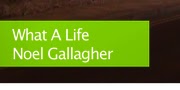
To add the opening and closing titles Matt went onto the MTV website and grabbed a section of the green that is associated with MTV ROCKS. He then opened the image in Final Cut dragging it onto the timeline, then re size the picture so the dimensions were correct and it was on the screen for the correct time.

Matt then set about adding the text to the box. He selected effects and then clicked on the Video Generators section, this showed a section named text, when Matt clicked on this another menu popped up that allowed text effects. However we wanted a simple text so Matt clicked on text again, this then allowed Matt to write the text that was needed, ' What a Life' -Noel Gallagher. He then dragged this text from viewer to the timeline and matched it up with the green background making sure it was allinged. We also needed the green box to appear slighlty before the text pops up because this is a key convention. Finally Matt added a transition to the box, if it appeared from no where it would look very odd and would not fit in with the rest of the video. Adding this transition was done easily it was done exactly the same as all the previous transitions in the video.