Saturday, 25 February 2012

Further Editing

All music videos have tranisitions and Final Cut allowed us to add a wide range of genre specific transitions to complement our clips and enhance our video. Adding transitions was very easy and was done by selecting the start or end of the clip. If we wanted to add a fade out we would select the end of the desired clip and if it was a fade in we selected the start. We then had to click on what transition we wanted, because our genre is Alternative Rock we used fades and cross dissolves. This is because these transitions are evident in many Alt Rock videos and are a key convention that we must follow if we want to make a realistic video.
In our video we decided that some footage would look more effective if it was slower, some of the clips were over before our target audience would have been able to see the footage and take the connotations. Matt decided to slow down some of the footage so people could appreciate it more, he did this by selecting the clip that needed to be edited then going to the tab Modify and selecting Speed. This then pops up a sub menu which allows you to alter the percentage of the speed. Because we were looking for a slower effect we had to decrease this percentage, we were then able to watch the clip in viewer and make ammendmants if needed.


We were able to lock clips on the timeline so that they remained in place, especially after Matt had made sure the lip sync was tight. On some occasions we found that when footage was dragged on to the timeline it moved footage that was in the way knocking it out of the specific position it had been put in. Locking the clips meant that this stopped happening we were also able to lock the track so that did not fall out of allingment with the clips. If we need to unlock tracks we were able to do this easily and the re lock the footage once we had edited it. This was done by clicking on the pad lock.(right)

Tuesday, 21 February 2012

Filming Four

We made another trip up to London with the understanding that we had to get our filming right.
One of the main criticisms we received was our lack of point of view shots. Due to the fact Glenn was available after 12.30 Adam Matt and I went up to film some of the shots that we had not got in previous filming. We decided that there was not enough perspective shots so we filmed some of these whilst we waited for Glenn to arrive. We felt this was an effective way to use our time in London without Glenn.          
Unfortunately I had work later on in the day so I had to leave before Glenn arrived, but Adam and Matt stayed in London to film with Glenn. They revisited the tunnel that we filmed in previously, this time it was lighter. This was significant because we found that our footage was clearer when we got back to the class room, which makes for a better quality video.
Notion of Looking
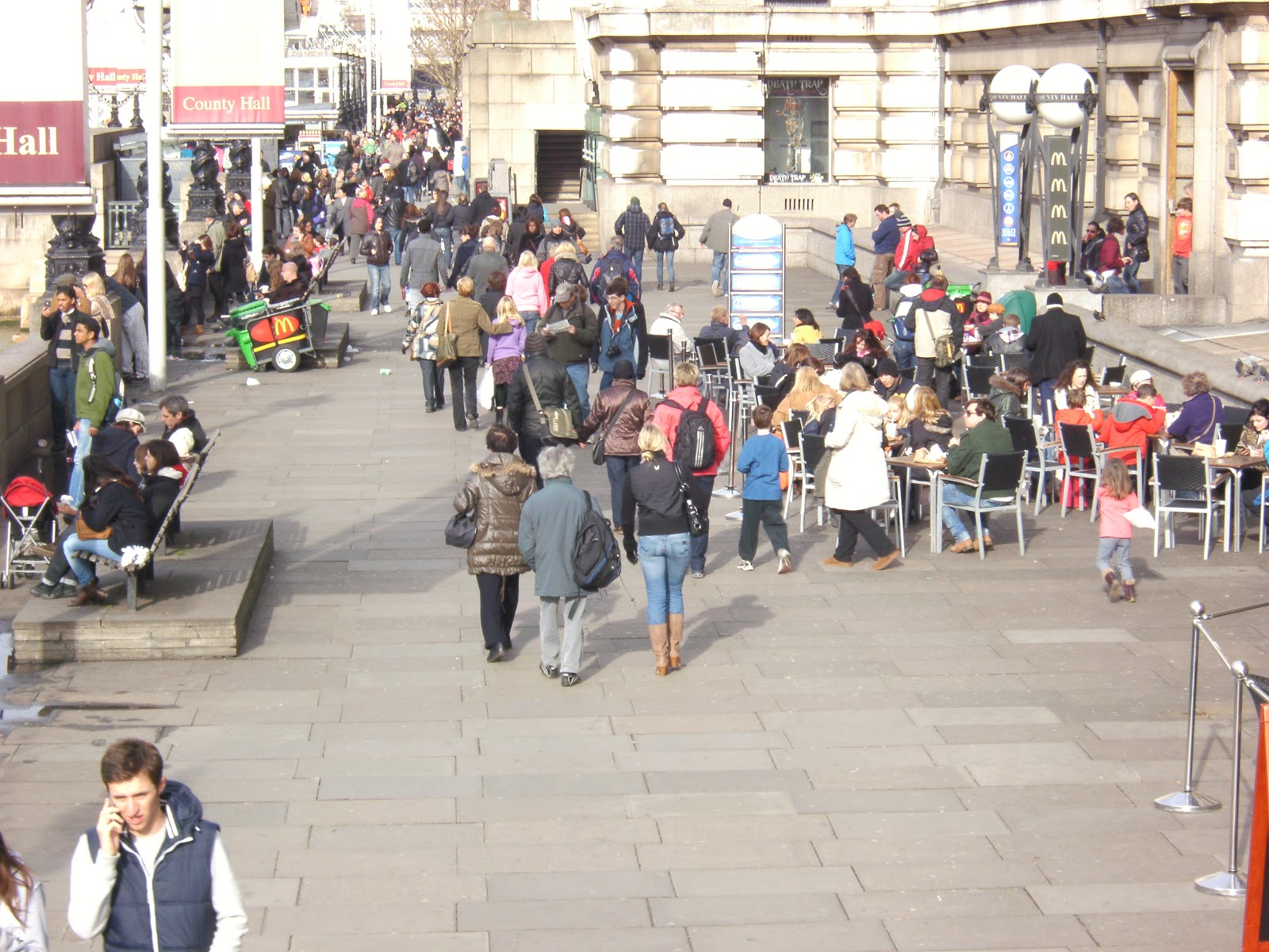
These are some of the shots that we have come up with, we wanted to show more people in and around London and define life. This shot on the right presents the concept of voyeurism which is a key convention of music videos.                                                                           


P.O.V Shot
The picture on the left was taken on Southbank and is another point of view shot which shows Glenn observing life. This also creates voyeurism, this is something we felt there was not enough of in our rough cut.

Monday, 20 February 2012

Editing

The small picture on the left is the viewer box, this is a preview of what the final video would looks like. This is a useful tool because we can watch the footage as we are editing it, this helps us identify mistakes in our work and put these right. This box allows us to edit save time, without this box we would have to edit all our mistakes we have not identified at the end of the editing proccess.
This shows the video with all the added effects and tranisitons that have been added in final cut, we can see how the transitions fit the music if they do not then we can take them out during the editing proccess rather than noticing at the end.


The first thing to do on Final Cut was to add our audio track in so we could see how our visuals looked up against the music and also identify areas that the lip sync was off. Matt did this by opening the audio file and dragging it to the bottom of the panel. The audio track is in green and located at the bottom of Final Cut, this is what it looked like when the track was imported.

Another section on Final Cut is the browser section, which stores the uploaded footage in one place. This was useful in saving time, we did not have to search our computer every time we wanted to edit footage. One of Final Cuts key elements is Non Destructive editing. By using the mark in and mark out tools which do not delete our footage. This enabled us to re use footage had Final Cut not have had non destructive editing we would have had to take extra care in what clips to use and the process would have taken a long time. We also named the clips that have been uploaded, this contributes to the effciency of Final Cut. Going back to the mark in and out tools, we simply loaded up the footage and then when we started to edit we clicked mark in to start the cutting proccess and mark out when we had the clip we needed. We then dragged the clip into the timeline, the clip thats selected remains in the browser section and is not deleted.


This is what the clip looks likes when it has been dragged onto the timeline, it shows a small shot of the first frame of the footage. It also shows the name and the length of the footage.

Once Matt had gone through all the footage and with close reference to our animatic selected the footage the timline began to become more populated with seperate clips. Below is what the timeline started to look like.

When Matt was editing the footage he found that there were several black gaps that needed filling with footage. However because the timeline was showed the video in minutes these gaps were very small and could not be seen. Matt seeked advice from a class mate, what he then did by using the tool in the bottom left of the timeline was make the clips bigger. All he did was drag the dark grey arrow in between the two black arrows. This allowed him to make the clips bigger by being shown in millieseconds rather than seconds, which made to gaps easier to see, enabling Matt to fill the gaps.

Saturday, 18 February 2012

Conventions of Music Magazine Adverts

gif maker

Before we make our magazine advert we need to research professional work that is seen in magazines such as Q and NME. We need to discover the key conventions of magazine adverts so that we can bear this in mind when making our own advert.

So firstly the image, the main image is normally a close up of the band/ artist. This is to promote the artist people will see the performer on the front of the advert and  remember the face. If the performer is well known the audience will recognise them and link that advert to a previous song or album that they liked. The gaze of the performer varies, generally the main character is looking at the camera, this is to try and engage them with the customer. People will be more encouraged to buy the album if they feel the artist engages with the audience. The shot of the artist is normally a close up again to involve the audience, the more involved the audience feel the more likely they will buy the album.

The title font is normally large and bold, capital letters are used to catch the eye of the audience. The title font is what the promoters want the audience to see. The colours are generally bright in order to catch the eye of the potential buyer. However if the colour does not fit the house style it will not be used, for example the Myo Oxyloto the colours work because the album is based around colours, the album Every Teardrop uses flowing painting images that link to the album. Rihannas magazine advert uses the colour red for the title font. This colour is picked from Rihannas hair so it links the picture and the image which strengthens the house style. Jessie J's album also uses a bold colour to capture the audience they have used the colour gold for the artists name, however in this the picture dominates half of the page. Our eyes are still drawn to 'Jessie J' the gold colour is also used throughout the advert.

In magazine adverts colours are used to grade the importance of the information. For example 'NO. 1 Album' on an advert would be written in a colour that catches the eye, when someone is browsing through a magazine they will immediatley see this phrase. This is similar with ratings the adverts aim is to get people to buy the album this means they have to show how good the album is. They do this by showing ratings they have recieved and put them in vibrant colours so peoples attention is drawn to it.

Some adverts for example Plan B's and Rihanna's their is a small screen grab of the album. This is so people know what they are looking for in the shops. This is a useful tool to promote the digipak of the artist stregthening the link between the two.

Tuesday, 14 February 2012

Grasping Final Cut

In our AS Media Studies we were introduced to a programme we had never use before in Photoshop. This was similar at A2 with the use of Final Cut. We started to get to grips with Final Cut when editing out animatic, this will make us more confident when editing our final video. This practice will allows make the editing procces quicker and increase the quality of our editing.

Final Cut will give our video the professional edge that other software can not offer, we would have the tools that professionals have when making big budget music videos. This gives us the best oppurtunity to make a great video, we will not be held back by lack of transitions or available effects. Final Cut will help us make our product genre specific and link to the digipak and advert we will have to make. It will help us by its range of tranisitions, we are able to use cross dissolves and fades that are a key convention of our genres music videos. This will help us reach our target audience easily.

Below is the layout of Final Cut, it allows you to add several tracks on one timeline we will also be able to import audio and match the visuals and the lyrics. We had to watch several videos on You tube as well as manual given to us by our teacher to get the grips with the software.

Thursday, 9 February 2012

CD analysis


Oasis Single Covers

Noel Gallaghers High Flying Birds is a fairly new band so they do not have a lot of single covers to look at. I decided to look at a band with plenty of single covers that were in our genre, who better than Oasis, Noels former band.

The bands name is always written in the same style, this creates Oasis's house style and develops a relationship between all of these single covers meaning they are all linked. However on certain tracks they have decided to change the colour with them favouring the plain black and white. When people see this they are instantly reminded of oasis straight away.

The position of the name is varied, generally the easy thing to do is to place the name at the top but Oasis have not stuck to one position, and even place it on the guitar for the video importance of Being Idle.

Not all of the single covers actually state the name of the song, this is interesting because how are people supposed to know what song they are buying. Going 'by the book' you would say that you cannot have a single cover without the name of the single on it by Oasis are notorious for going against the grain.

I have noticed that three if these single covers are fairly similar, the covers with the dark background with the semi circle of light, are easily linked.

Wednesday, 8 February 2012

Noel Gallagher Digipak


Noel Gallagher band 'High Flying Birds' are a british band that formed in 2010, they have just released there first album called High Flying Birds. Here are three single covers and the cover of the album, bottom left. We found the album cover in Q magazine, which then led us to search for some of the single covers. This was also used as a magazine advert in Q which took up  awhole page, this was useful to us because it helped us see what adverts from our genre look like.

Originally we took some pictures of Glenn facing the camera, but  upon further research you can clearly see that in most of these album covers Noel is not facing the camera. Except the album cover, but even that is blurred, this research has altered our original ideas. We will have to make a CD cover for our Digipak and we will have to take into consideration house style, which these four covers do very well. The title font 'Noel Gallagher's High Flying Birds, is the same across all four, this keeps consistency and continuity across the covers. It also means that if you had thousands of album covers you would easily be able to group these four together. The song names are even in the same font which contributes to the house style. We searched on da fonts, and looked at the handwritten section of the fonts, we looked at the effect Noel Gallagher has created doing this and decided to see what it would look like, so Adam found a list of fonts that we fitted this description.

On further analysis you can see that the pictures have little relevance to the song title, however the picture for the cover of What a Life, uses a location that is seen in the video. However 'The Death of you and Me', the location on the cover is not even seen throughout the video, this gives us something to ponder. Do we use a location that is seen in our video, it could be shot from a different angle or height, this will help create a link between our video and CD cover.

There is also a link between them in terms of the lighting and effects used, if you look carefully all the single cover, the colours start at an faded turquoise. It then changes across to an orange, this is a subtle touch but it works with the pictures. I had a go at doing this on Photoshop, if found a plain picture of Noel Gallagher. I originally tried doing it over the whole picture but it did not look right. So I used the Quick Selection Tool, to cut out the background, I selected the gradient tool and found the colours that matched the effect on the cover 'What a Life'.


We have decided not to use the 'normal' setting for the overlay, but changed to 'colour burn', we felt that it gave us the effect that we wanted.